At DigiComm Solutions I delivered SimpleTouch POS, a retail point-of-sale application, on time and within budget by gathering user requirements, coordinating a UX/UI design team in Figma, and managing sprint timelines and stakeholder approvals. I conducted usability testing with end users and translated feedback into actionable UX improvements that reduced friction and improved task completion across core workflows. Produced user flows, wireframes, high-fidelity mockups, and interactive prototypes in Figma, and maintained UX and brand consistency through a reusable component library, color system, and typography standards. Below: the design process from wireframes through the working terminal demo.
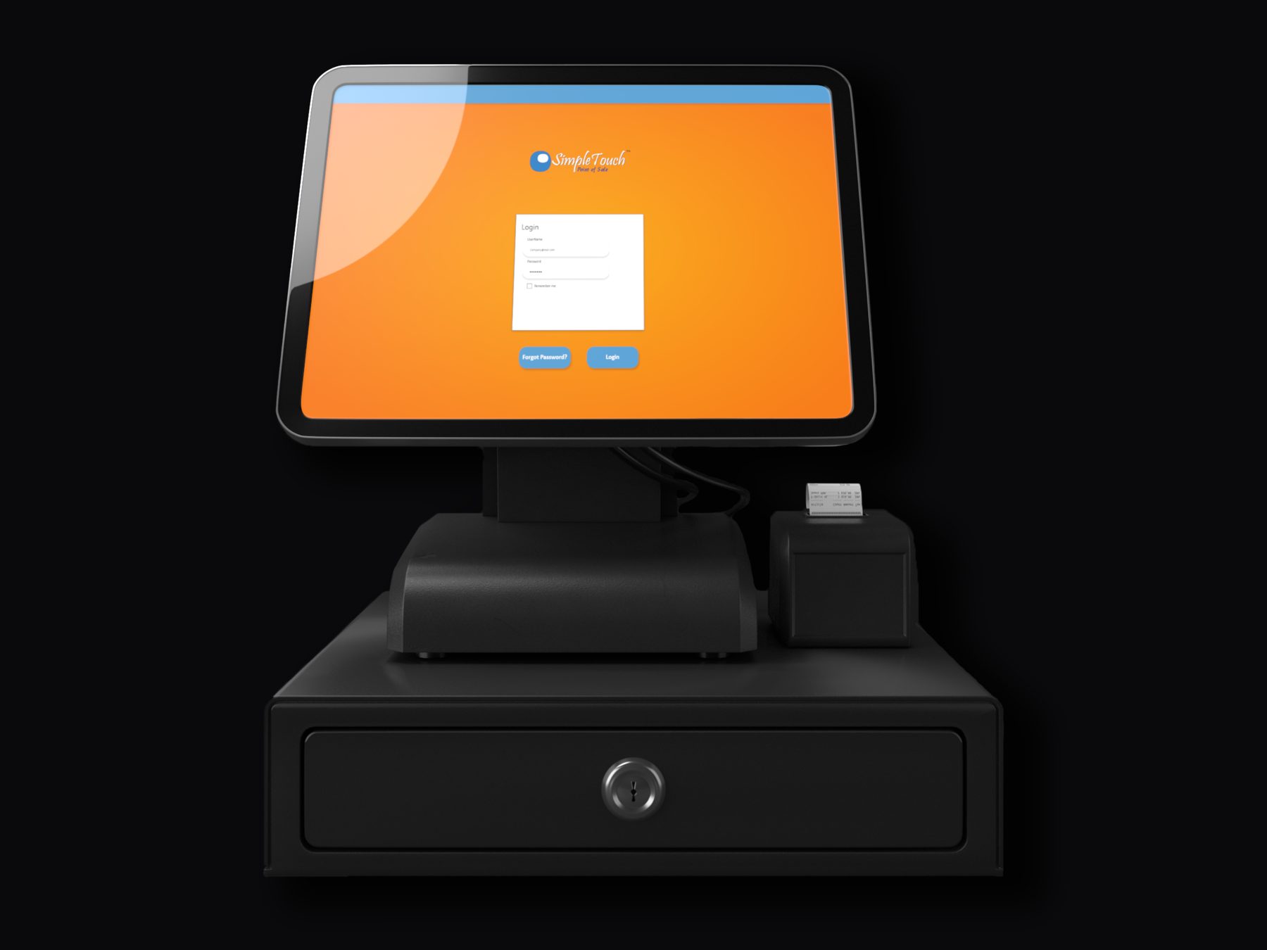
01 · Sign-in screen
The cashier's first screen each shift. I designed it station-aware ("Sign in to your station," not "Sign in") because in retail the device is the persistent context, not the user — multiple cashiers share a single terminal across shifts. Single primary CTA, no competing buttons. Forgot-password is right-aligned because it's a secondary action.

02 · Dashboard
After sign-in, the cashier lands on a POS-first dashboard. The hero "Open Register" CTA banner sits above the metrics so a cashier starting a shift can begin ringing up orders in under a second. KPIs (revenue, transactions, average ticket, low stock) are scannable but secondary. Quick actions and recent transactions fill out the bottom of the page for managers and end-of-shift workflows.

03 · Register / cashier screen
The actual cashier interface. Two columns: the order side on the left (totals, line items, numpad, action button rows) and the catalog side on the right (search with barcode-scan support, customer banner, categories pinned left + items grid that scrolls). The Charge button sits in the bottom-right as the largest target on the screen, in green to signal "go." Action buttons follow a color system — red=destructive, yellow=hold/payment, blue=info — so risk level reads at a glance.

04 · POS terminal
A working recreation of the SimpleTouch terminal flow. PIN login (any 4 digits, or just hit Enter) → select items from the catalog → checkout. The sidebar tracks where you are in the flow.
05 · Wireframe to finished design
Component libraries, color tokens, and typography rules lived in Figma so consecutive screens stayed consistent with one another. The slider below morphs between the wireframe stage (gray-on-white, structure only) and the finished design. Drag the slider to see the design come together.


What I'd do differently
The single biggest win would have been earlier moderated usability sessions with cashiers on real terminals, before we locked in flow patterns. Testing happened late enough that the feedback shaped polish rather than core decisions. On a future engagement, I would build the test cadence into the sprint structure from week one.