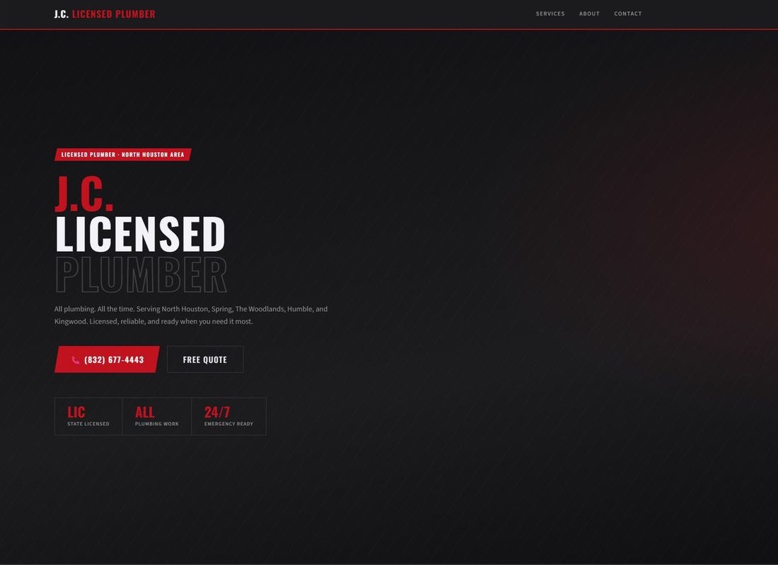
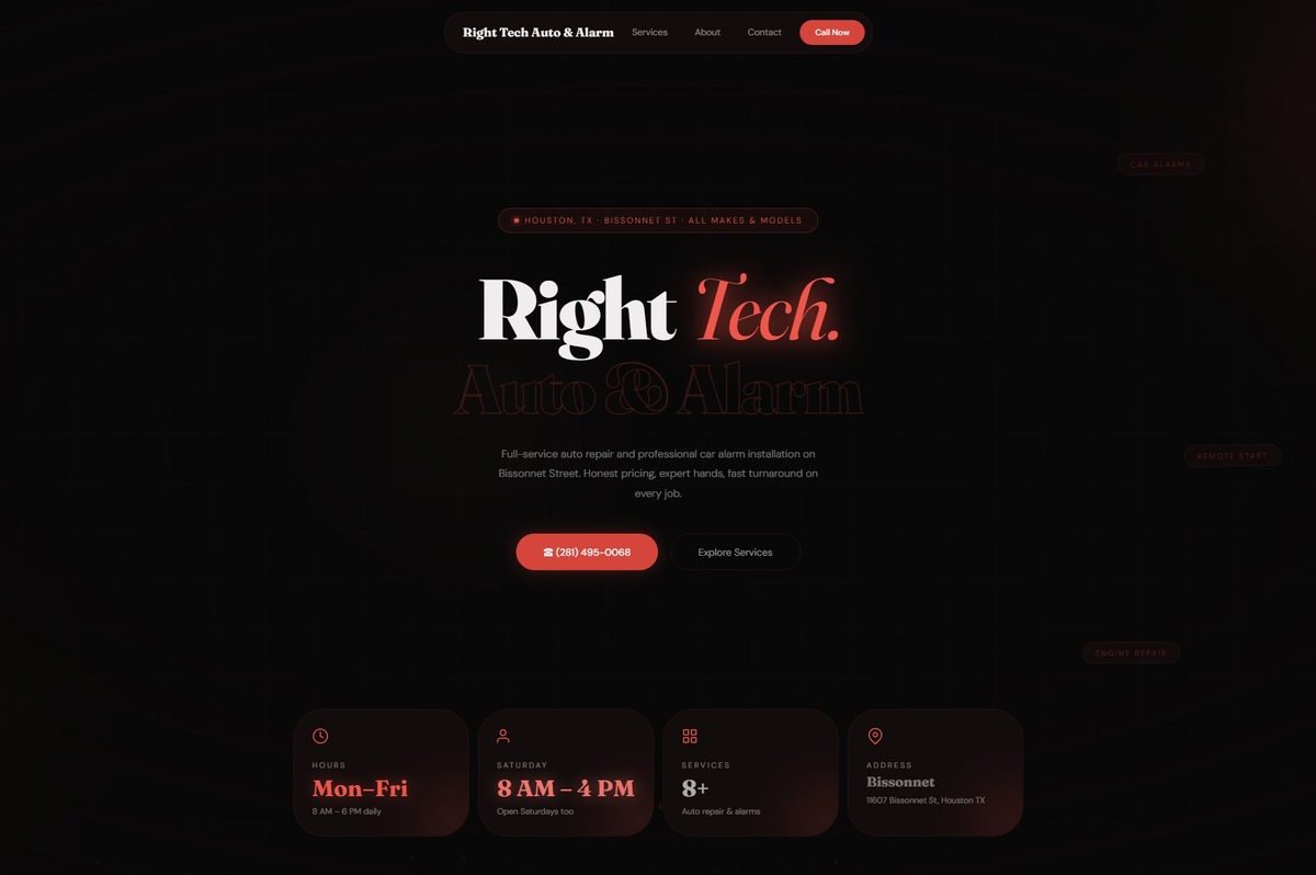
At NetTracePro, a Houston digital agency, I deliver client websites end-to-end as part of a small team: discovery, brand identity, UX/UI design in Figma, and shipping the front-end in React and Vite. Alongside the site work I produce print and digital collateral — brochures, one-pagers, social graphics, and web banners — and I'm building out automated client delivery workflows in HubSpot so engagements run cleanly from kickoff to handoff. Below: the recent client engagements, recreated as an interactive map.
01 · Client work
Each engagement followed the same pattern: discovery call → design comps → iterate → ship. Average time from kickoff to live: about two weeks. The studio takes ownership of design, build, and post-launch maintenance so the client doesn't have to coordinate three vendors. Hover or tap any of the four below to see what that engagement looked like.
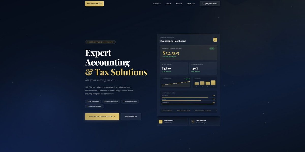

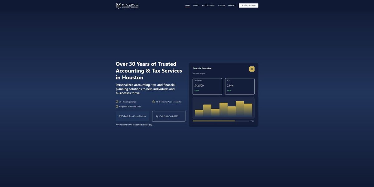
02 · M.A. CPA redesign
The CPA was an existing site that read generic services firm. The redesign pushed it toward professional service, editorial typography, a real-time tax-savings dashboard, calmer color palette, conversion-focused CTA grouping. Drag the slider to compare the two states side-by-side.
03 · Delivery stats
NetTracePro's offering is tight scope and fast delivery. A typical engagement runs two weeks from kickoff to deployed site.
04 · Studio brand identity
Alongside client work, I designed NetTracePro's own visual identity: the wordmark and the interlocking NTP monogram, applied across web, social, and contracts.
05 · Information architecture
The site needed to do one thing well: convert small business owners from "Houston web designer near me" into qualified leads. I started with a flat sitemap — five primary pages, sub-pages reachable in two clicks from Home, all conversion paths leading to Contact. Avoided deeper nesting so users never feel buried.

06 · User flow
Two paths through the site: a fast path for users who already know what they need (Home → Contact, with a Pricing detour for the hesitant), and a longer trust-building path for skeptical users (Home → Portfolio → Case → Contact). Decision logic is explicit: every page reaches Contact within one click, no dead ends, no forced sequences.

07 · Homepage wireframe
With architecture and behavior locked, I wireframed the homepage: nav with five anchors, hero with a single primary CTA and supporting secondary, three-up service grid for category clarity, pricing teaser to defuse the "agency = expensive" objection early, and a four-up portfolio grid as social proof. Annotations called out the rationale for each section so the build phase had no open questions.

08 · Mobile companion
Every desktop wireframe got a mobile companion before development. The mobile pass forces decisions about what survives the constraint: 5 nav items collapse to a hamburger, the side-by-side CTAs become full-width stacked, the 3-up service grid becomes a vertical list, and the portfolio grid shows two thumbnails above the fold instead of four. The primary CTA pattern stays consistent across viewports so the conversion path doesn't change with the device.

A small business doesn't need a system designed for an enterprise. It needs the smallest possible system that still works on a Tuesday afternoon when nobody's watching.